The Problem
Pilots needed to be notified when flights were available that matched their criteria.
“Greg is a brilliant UI designer! I’ve learned not to give him very much direction because I know if I just explain the problem, Greg will come up with a WAY better design solution than I had in mind.”
What I did
One of the client’s other products had a similar feature, in a much older design style, and they wanted to bring it to the newer product.
However, the older product was not designed with a mobile, responsive mindset, so we needed to keep the interactions familiar, but improve them for better usability.
Stakeholder Interviews
The experts at eTT Aviation knew well what the users were looking for, as they had the capability for over 10 years in their other product.
I was able to work with the stakeholders and experiment with the existing product to get a good idea what was needed quickly. In one of my other projects with eTT, I had already established a new material design system, so it was a matter of translating the complex filtering requirements into a mobile-friendly design.
Wireframe Design
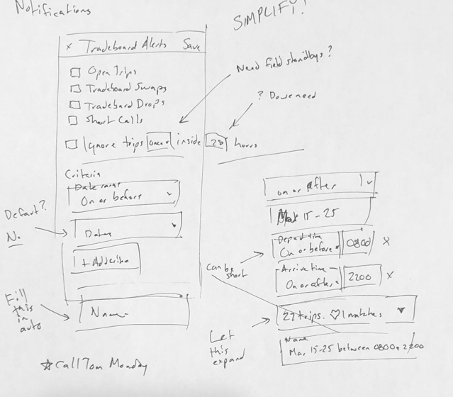
Progressive disclosure was a key design challenge here. Although the users were technically savvy and used to complex controls in their experience with flying, users could be easily overwhelmed with all of the available options.
Following design patterns for filters, such as those found in Smart Playlists, I simplified the initial state. By filling in fields with reasonable defaults, such as generating a name for the notification request based on the criteria chosen, we allowed the users to enter a minimum of information.
Automatically loading matching trips once valid criteria were entered into an expandable section, saved the user a step. In the old design the button for this was well-hidden. The expandable section has the additional advantage of not cluttering up the screen if they are not looking to preview trips at the moment.
I also determined the most critical information about matching flights to include in the text message notification, to ensure the user could get the info they needed at a glance, without launching in to the web app.
Visual Design
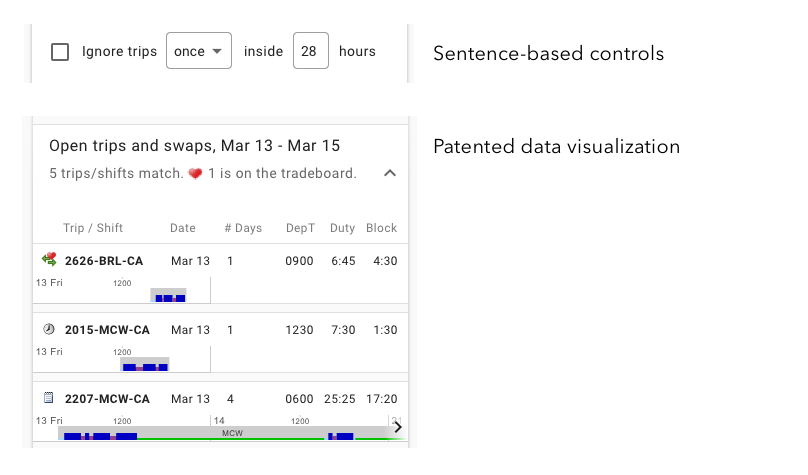
I diverged from standard Material Design to include smaller sentence-based dropdown controls to allow for a narrative, readable filter that fit on a phone screen.
I designed the visual trip indicators that show the segments of a series of flights including layovers and flight durations. For this work, we filed for a U.S. patent for the design.
I also located an open source date range selection control for the development team to use, since Material Design does not have a standard one built-in at this time.
The entire story workflow.


