Teacher Evaluations: Silverback Learning
Lack of responsive design made the application unusable on mobile devices.
Important functions were hidden from view and training was required for new users.
“Greg’s designs are elegant, simple and surprisingly intuitive! A smart user interface can make all the difference in adoption and satisfaction rates, Greg has an eye for designing software products that users can begin using immediately and want to continue using. ”
What I did
The stakeholders knew that the application could not be used on a small screen, and a redesign would be needed. Even a tablet-size screen led to usability challenges for a user.
Even if the information was laid out in a readable manner, I suspected there were mismatches between the hierarchy of information displayed and the importance of tasks to the users. The same screen layouts were also being used for 2 user types that had quite different usage patterns.
User Research
I discovered from the team what they felt were the current challenges, based on their experience training and supporting hundreds of users over the years. I quickly learned the user personas, key use cases, and impersonated users to learn the software for myself.
To validate the language of the different users and understand task importance, I designed a survey to gather both quantitative and qualitative information about these areas. The survey was easily executed online, and we learned several useful pieces on information:
For example, the most important term for the “School Principal” persona, “Evaluations” was rarely displayed in the user interface.
In addition, the important Note and Photo Note taking and recording capabilities were inaccessible without several hard-to-discover clicks.
Wireframe Design
I always start in pencil! I grabbed my trusty notebook and started imagining different ways the capabilities could be laid out. Some of the design challenges included:
Many of the screens included large tables, which would not scale well
The “School Principal” user had 7 or 8 top level navigation items, which would not scale well to a tabbed display.
Many of the evaluation forms to be filled out were large and long, and would be partially filled out over the course of days or weeks, so it was necessary for the user to determine what was still needed to be done.
Developers had an aging component library that was in use, and “everything was a table” even when that was not necessarily the best user experience
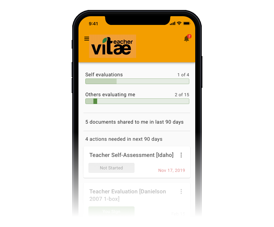
Using the Material Design system, I was able to create a new design that helped solve all of these issues and more.
Some especially effective concepts included converting Tables to Material Design Cards at smaller screen sizes, and moving sorting and filtering capabilities (when needed) into a more mobile-friendly layout.
Visual Design
I chose a visual design, working with the client, that leaned heavily on stock Material Design, to reduce the customization effort on the development team.
We incorporated branding on to the dashboard page. The corporate color scheme was brought forward into the new design to provide a sense of continuity.
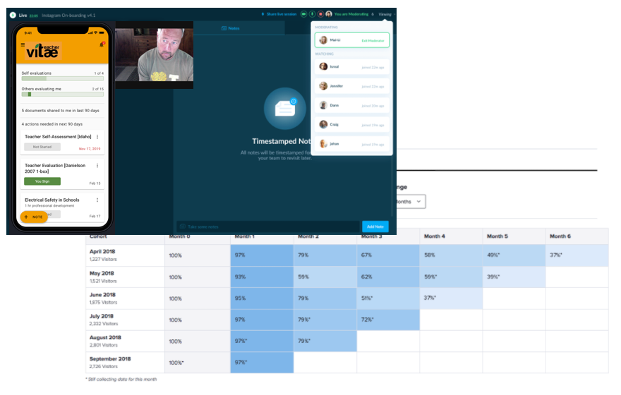
The dashboard was rethought completely, to allow a quick view of the most actionable information. When sections are not needed, they are completely hidden, rather than showing empty tables.
User Testing & Optimization
This project is ongoing! We plan to test the prototypes with 3-5 users of each of the major personas, to find feedback, incorporate it, and improve the design.
Once the changes release, I’m advising the client to instrument the code with analytics, so that we can gather quantitative information on the use of the software. We will use this to iterate and improve on the original design over time.


